

The Burma-Shave Rule: Sign Design Psychology for Billboards, Storefronts and Vehicle Wraps

Law Smith
Founder & President, Tocobaga
Law Smith is the Founder and President of Tocobaga, a Tampa-based ROI-focused marketing agency and SMB advisory. He has strategically advised 1,000+ small and medium businesses, executed 600+ integrated marketing campaigns, and written 30+ business plans across industries ranging from professional services to e-commerce to B2B technology. Tocobaga is a Google Partner and Squarespace Gold Partner headquartered in Ybor City.
In the fall of 1925, Allan Odell was a Minneapolis salesman with a product nobody wanted, a father who had bet on it anyway, and a deadline set by the weather.*
The father was Clinton Odell, an insurance man whose doctor had told him to find less strenuous work. With a chemist friend, he cooked up a brushless shaving cream and named it Burma-Shave, because several of the ingredients came from Burma.† Door-to-door sales went nowhere fast.† So Allan pitched an idea that sounded like a stunt: small wooden signs along the highway. He and his brother Leonard built homemade sets and planted them along two highways leading into Minneapolis, racing the frost before it made the ground too hard to dig.† Repeat orders followed.
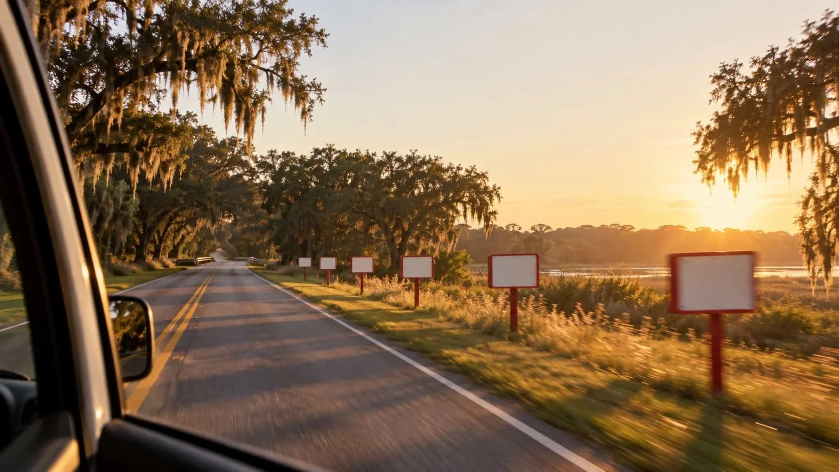
The format was strict. Six small boards, one line per board, planted fifty paces apart. The fifth board usually carried the punchline, and the sixth said Burma-Shave.† A typical set read: "PITY ALL / THE MIGHTY CAESARS / THEY PULLED / EACH WHISKER OUT / WITH TWEEZERS / BURMA SHAVE."* American Heritage's Frank Rowsome Jr. did the timing: "At thirty-five miles an hour it took about eighteen seconds to roll through the whole series."† Thirty-five miles an hour is about 51 feet per second, so eighteen seconds is roughly 920 feet of road. A newspaper ad fought the rest of the page for attention. A Burma-Shave set fought a cornfield, and it won.
The Odells were sightline engineers before anyone used the phrase. Their crews wanted a straight, fairly level stretch at road height. They knew that if a set began just after a curve, some people would miss the first sign or two, and they steered clear of big billboards that could eclipse part of a series.† At the height of the program there were 7,000 sets in 45 states, and the Smithsonian's own catalog note says the signs "made sense only to someone traveling at 35 miles per hour."‡
Then the road changed. Faster cars, limited-access highways and television ads that delivered more reach for the money did what no rival shaving cream could, and the sign program ended in 1963.‡ By then the company had been absorbed into Philip Morris, which could no longer justify the expense.* The jingles did not get worse. The reader got faster. That is the entire psychology of signage in one obituary. Every sign is a deal struck with a moving reader's attention: this much speed, this much distance, this much sightline, room for this many words. Federal Highway Administration researchers now measure the terms in milliseconds.§ Burma-Shave honored the deal at 35 miles an hour. When the interstates rewrote the terms, the format died.
Tocobaga, a marketing agency in Ybor City, watches owners across Tampa Bay strike the same deal every day, mostly without reading the terms, and more and more of them now hand the art to ChatGPT or Midjourney. A plumbing van on Interstate 275. A storefront in a Brandon strip center. A 53-foot trailer running Interstate 4 at dawn. A billboard on the approach to the Howard Frankland Bridge. The art on all of them increasingly comes from the first image the chatbot produced: the one with the soft painterly glow, the swirling gradient, and the lettering that looks like English until someone tries to read it.
AI slop on a 53-foot trailer is still slop. It is just bigger, and it is moving at 65 miles per hour.
The counterexample is a sheepdog. In Dumb and Dumber (1994), the Mutt Cutts van is a 1984 Ford Econoline dressed in tan carpet with floppy ears, legs, a nose, whiskers, a tongue and a tail.‖ Nobody needs to read a single word on it to know what kind of business it belongs to. It is absurd, and it is near-perfect sign design: one unmistakable idea, legible from across the street, at any speed. This post walks through what the Federal Highway Administration, the National Highway Traffic Safety Administration, sign-industry legibility standards, eye-tracking studies and consumer surveys actually say about how long people look at signs, how big the letters need to be, where a sign should sit, what makes it memorable, and why the default AI output fails the test. It ends with a one-second test and a briefing method that keeps the next van wrap out of the slop bin.
How long does anyone actually look at a sign or billboard?
Not long. In federal on-road eye-tracking research, drivers' individual fixations on billboards averaged about a third of a second, and in European field data most glances at roadside ads ended in under one second.
An FHWA-sponsored study put instrumented, eye-tracked cars on real roads in Reading, Pennsylvania, and Richmond, Virginia. The average fixation on a digital billboard was 379 milliseconds; on a standard billboard, 335 milliseconds. The longest single fixation on either type was about 1.3 seconds.¶ A literature review prepared for the Conference of European Directors of Roads found the same shape of behavior. In one field study, drivers looked at 69 percent of the static billboards they passed, but 82 percent of those glances lasted less than one second, 16 percent lasted one to two seconds, and only 2 percent ran longer than two.** Another study in the same review clocked the average look at 0.86 seconds.**
Now the part that matters to a business owner. A 2013 Federal Highway Administration review summarized a study in which billboards whose advertisements participants correctly recalled had drawn an average fixation of 2.31 seconds, while billboards that were not recalled drew mean fixations between 185 and 444 milliseconds.§ Do the division: the remembered boards held the eye roughly five to twelve times longer than the forgotten ones. The same review delivered the line every sign buyer should tape to the monitor: "fixation on an object and awareness of that object are not interchangeable."§ Being seen is not the same as being read. Being read is not the same as being remembered.
This is where most owners draw the wrong conclusion. The lesson is not to design a sign that demands two-plus seconds of a driver's eyes. Federal distraction guidelines recommend that in-vehicle tasks pull a driver's eyes from the road for no more than two seconds at a time and twelve seconds total.†† A sign that only works with a long stare is a sign that only works on passengers. The job is to make the message finish inside the glance the driver was going to give anyway.
So the real attention budget for a roadside sign is measured in the same unit as a camera shutter. Too many businesses design it like a brochure.
How much time does a driver have to read a sign?
Less than the design review assumed. At 45 miles per hour a car covers about 66 feet every second and crosses a 300-foot stretch of road in about 4.5 seconds; at 65 miles per hour, the same stretch goes by in about 3.1 seconds.
The conversion is simple: feet per second equals miles per hour times 5,280, divided by 3,600. It is geometry, not attention; it says how long a sign is physically in range, not how long anyone actually looks. The table below runs that arithmetic for common speeds across a 300-foot window and adds how much road disappears during a single two-second glance.
| Speed | Feet per second | Seconds through a 300-foot window | Feet traveled in a 2-second glance |
|---|---|---|---|
| 25 mph | 36.7 | 8.2 | 73 |
| 35 mph | 51.3 | 5.8 | 103 |
| 45 mph | 66.0 | 4.5 | 132 |
| 55 mph | 80.7 | 3.7 | 161 |
| 65 mph | 95.3 | 3.1 | 191 |
| 70 mph | 102.7 | 2.9 | 205 |
The last column is the sobering one. At 65 miles per hour, a two-second glance at a sign means about 191 feet of road driven without looking at it. That is why the safety ceiling and the design target are different numbers, and why a smart sign is built for a third of a second, not two.
Burma-Shave's math aged badly for the same reason. The roughly 920 feet that took eighteen seconds at 35 miles an hour takes about nine seconds at 70. Double the speed, halve the poem.
The United States Sign Council Foundation, which publishes legibility standards for on-premise signs, breaks reading time into pieces. Detection takes one-half to one second, depending on roadside complexity. Reading takes "one-tenth of a second per letter," the council's computational standard. Drivers glance back at the road for at least half a second for every two and a half seconds of reading, and the maneuver itself (slowing, changing lanes, turning) takes four to six seconds.‡‡ The council's typical message is six words and 30 letters, which works out to three seconds of pure reading before anyone touches the brakes.‡‡ Its averages call for about eight seconds of total reaction time in a simple environment and 10 to 11 seconds in a complex, multi-lane one when the maneuver has to happen before the driver reaches the sign.‡‡
At 45 miles per hour, eight seconds is 528 feet. A business that needs a driver to turn into its parking lot needs that driver to recognize the sign more than 500 feet before the driveway. Too many storefront signs are designed to be read from the parking lot, which is to say, by people who have already arrived.
How big should letters be on a sign?
A defensible starting point is about 1 inch of letter height for every 30 feet of viewing distance, then larger for cluttered roads, all-capital lettering, weak contrast and signs mounted parallel to traffic.
The Federal Highway Administration's 2013 conspicuity review states the baseline plainly: within about 3 degrees of forward vision, high-contrast letters should be legible to most drivers at 1 inch of character height for every 30 feet of viewing distance.§ Under that ratio, 6-inch letters reach about 180 feet, 10-inch letters reach 300 feet, and 20-inch letters reach 600 feet. For the 528-foot read in the previous section, the math calls for letters close to 18 inches tall.
The sign industry formalizes the same idea as a legibility index, defined by the Sign Council as "the distance in feet for every inch of capital letter height at which a sign may be read." Its average standard index is 30, matching the federal ratio. In moderately congested areas the council multiplies by 0.83, dropping the index to 25; in highly congested areas it multiplies by 0.67, dropping it to 20.‡‡ Translate that to a 300-foot read: about 10-inch letters on a quiet road, 12-inch letters on a busy commercial corridor, 15-inch letters in heavy clutter. Same distance, same message, 50 percent more letter height because of everything else competing on the roadside.
Typeface, case and lighting move the number too. The council's examples put black Clarendon letters on a white background at an index of 31, and externally illuminated, all-capital Helvetica in light letters on a dark background at 22.‡‡ On 10-inch letters, that is the difference between about 310 feet and about 220 feet of legibility, roughly 29 percent of the reading distance lost to style choices rather than size. The council also calls for a 15 percent increase in letter height when a sign uses all capital letters.‡‡ Ten inches of mixed case becomes 11.5 inches of shouting.
Then there is the empty space. The Sign Council's minimum standard is a 40/60 relationship between copy area and negative space, and it states that negative space "should never be less than 60 percent of the copy area."‡‡ Owners tend to see blank background as paid-for square footage going to waste. The legibility standard treats it as the reason the letters work at all.
Stroke weight follows the same logic. Hairline serifs, script fonts and thin outlines that look elegant on a monitor simply disappear at distance, because the eye is resolving the shape of each letter at a fraction of its designed size. Bold, open letterforms with generous spacing survive the trip. Delicate ones do not.
The common failure is the opposite of what owners fear. They buy square footage, then fill it with a logo, a tagline, six services, a phone number, a website, a license number and a photo of the truck. The sign gets bigger and reads worse.
Where should a sign sit in a driver's sightline?
As close to the driver's forward line of sight as the site and the local code allow, facing oncoming traffic rather than running parallel to it, and far enough ahead of the driveway that recognition happens while the driver can still act.
Peripheral placement costs time. The 2013 federal review gives an example: a speed limit sign with 12-inch numerals set 12 feet from the edge of the road can be read from 85 feet without a glance away from the forward roadway in low-workload driving, but closer than 85 feet, a glance away becomes necessary.§ At 45 miles per hour, 85 feet is about 1.3 seconds of travel. A sign tucked off to the side does not get a leisurely read. It gets a sideways look the driver has to justify.
The European review lands in the same place: the closer a billboard sits to the driver's forward road view, the more often drivers look at it, and billboards at street level draw more looks than boards mounted a few meters up.**
Orientation may matter more than size. In a field study published in the Journal of Transportation Engineering, Penn State researchers tested on-premise signs on public roads with 120 older and younger participants, by day and by night. Signs mounted perpendicular to the road, facing oncoming traffic, were significantly more detectable and legible than parallel signs that were two and three times larger.§§ The Sign Council builds that penalty into its math, sizing parallel letters with a multiplier of three times the threshold height.‡‡ A flat wall sign on a building that runs alongside the road has to be dramatically larger to compete with a modest blade or monument sign that faces traffic, and in the Penn State test even double and triple the size did not close the gap.
Burma-Shave's crews already knew all of this. Straight stretch, road height, not right after a curve, nowhere near a big billboard.† A modern site survey is the same checklist with better tools. Drive every approach lane, with a passenger taking notes. Mark the trees, poles, other signs, parked trucks and turn lanes. Find the driveway decision point, the last place a driver can safely slow and turn, then back up four to six seconds of travel; at 45 miles per hour that is 264 to 396 feet. The sign has to be legible before that point, not at it.
For a multi-location operator, such as a private equity-backed platform rolling up regional service brands, this is where one national sign package meets 40 different sign codes and 40 different curb cuts. The brand standard can be uniform. The sightline survey cannot.
What makes a sign memorable instead of merely seen?
Conspicuity first, then a brand that is instantly identifiable, then a single idea. Creative cleverness pays off only after the sign has already won the glance.
A field study of billboards published in the International Journal of Advertising in 2015 found that creativity improved brand memory only after a billboard crossed an attention-capture threshold, and that size, visual salience and familiarity with the brand also drove recognition.‖‖ Put plainly, a brilliant idea on an invisible board is still invisible. The order of operations matters: get noticed, get identified, then get clever.
Clutter slows the second step. In a 2009 study published in the Journal of Advertising Research, CBS Outdoor used a tachistoscope, a device that flashes an image for a controlled fraction of a second, to measure how quickly viewers recognized the brand or product on 187 outdoor posters in the Netherlands. Clear branding sped up product recognition. Large amounts of text and pictures of people delayed it, and long, large headlines delayed brand recognition.¶¶ Every extra element on a sign charges a toll in milliseconds, and the driver is only carrying a few hundred of them.
One billboard company's published design standards cap copy at seven words, a working industry heuristic rather than a law of nature.*** The Sign Council's reaction-time math assumes six.‡‡ Either way, the budget is a sentence fragment, not a sentence.
The pop-culture proof is another vehicle. In Ghostbusters (1984), Ecto-1 is a 1959 Cadillac ambulance converted for ghost removal.††† It wears the no-ghost logo, a cartoon ghost inside a red circle with a slash through it. That symbol needs no words, no tagline and no explanation; a child can read it from across a parking lot. Pair it with the Mutt Cutts sheepdog and the rule is complete. One unmistakable idea, readable from across the street, attached to a brand nobody can confuse with anyone else.
Burma-Shave got the branding part right in the most stubborn way possible. Whatever the joke on boards one through five, the last board in each set said the same thing: Burma-Shave.† Decades of jingles, one sign-off. That is not repetition for its own sake. It is a memory structure, built one glance at a time.
Why does AI-generated slop fail on a van wrap or billboard?
Because default AI image output is tuned to look impressive on a phone held at arm's length, not to be decoded in a third of a second from 300 feet away, and audiences increasingly recognize it and discount it.
Merriam-Webster made the problem official when it named "slop" its 2025 word of the year, defining it as "digital content of low quality that is produced usually in quantity by means of artificial intelligence."‡‡‡ That definition fits more of the vehicle wraps rolling around Tampa Bay than anyone in the wrap business should be comfortable with.
I have nothing against AI as a design tool. I have a serious problem with an owner pasting a one-line prompt into a chatbot, downloading the first result, and emailing it to the wrap shop.
The critique is not about taste. It is about physics, and every point traces back to the research above:
Low contrast. Default AI images favor soft, glowing mid-tones, and legibility falls as contrast falls; the Sign Council's own examples swing from 31 feet of reading distance per inch of letter down to 22 on typeface, case and lighting choices alone.
Busy textures. Painterly brushwork and swirling gradients fill exactly the negative space that the Sign Council says should make up the majority of the face.
Fake lettering. Image models have gotten better at spelling, but a correctly spelled word in the wrong typeface, the wrong weight and the wrong spot is still wrong at 300 feet.
No hierarchy. The model does not know the brand has to come first, so the logo ends up carrying the same visual weight as a decorative wrench.
Nothing readable at distance. Detail that looks rich on a 6-inch phone screen turns to mud on a 53-foot trailer seen for a third of a second.
Sameness. A popular model's default style is everyone's default style, so a van that looks like every other AI van has paid thousands of dollars to be anonymous.
The consumer research points the same direction. In December 2024, NielsenIQ reported neuroscience research in which more than 2,000 participants watched AI-generated ads of varying quality, about 150 of them while wearing EEG sensors. Participants identified most of the AI-generated ads and described them as "annoying," "boring" and "confusing." Even ads rated high quality produced weaker memory activation than traditional ads, and low-quality visuals raised the mental effort needed to process them.§§§ Weaker memory and higher processing effort are precisely the two things a sign cannot afford, because a sign gets no second viewing on demand.
The trust problem goes beyond pixels. In experiments with more than 1,000 U.S. adults across eight product and service categories, Washington State University researchers found that describing a product as using artificial intelligence lowered emotional trust, which in turn lowered purchase intentions.‖‖‖ That study tested product descriptions, not imagery, so it does not prove that AI art on a van costs a contractor jobs. It does show that "AI" can carry a trust tax, and an obviously generated wrap announces "AI" in letters 30 inches tall without ever spelling the word.
Big brands have run this experiment in public. Coca-Cola released another AI-generated holiday ad in November 2025 despite backlash to its 2024 version; commenters called the new one "soulless" and "immediately forgettable," while the company said the previous year's film had performed exceptionally well.¶¶¶ When Toys 'R' Us debuted a minute-long brand film made with OpenAI's Sora in 2024, one illustrator said hiring actors would have made it "look a thousand times less uncanny."****
Both things can be true at once. A global brand with decades of distinctive assets (red trucks, a script logo, a polar bear or two) can absorb a mediocre execution and come out fine. A roofing company with three vans and zero brand memory cannot. The smaller the brand, the less margin it has for anonymous art.
AI is a tool. The default output is not a design. A table saw is a tool too, and nobody frames the first board it touches.
What makes a good vehicle wrap or semitruck wrap design?
A good wrap identifies the business and what it does in one glance from the side at traffic speed, then rewards the longer look from the driver stuck behind it at a red light.
Every vehicle has three audiences, and they have very different sightlines.
The side panels play to traffic in motion, and the geometry is brutal. Two vehicles passing in opposite directions at 65 miles per hour close at about 191 feet per second, so the side of a 53-foot trailer is alongside an oncoming driver for less than three-tenths of a second. A car overtaking that same trailer at 10 miles per hour faster has about 3.6 seconds next to it, and the driver should be watching the road for most of them. Side panels earn a brand, a category and maybe one more word. They do not earn a paragraph.
The rear doors play to a captive audience. At a red light, the driver behind a van has nothing to look at but the back of the van, and a stopped car is the one setting where a phone number or a web address can be read safely. That is where secondary information belongs.
The cab and the dock play to people on foot: customers in a parking lot, receivers at a loading dock, and the next round of driver recruits. For trucking, logistics and manufacturing companies, a fleet is an outdoor advertising network the company already paid for. It is also a recruiting billboard that parks at every customer's door, which is a reason to design it like one.
The industry likes big numbers here. Commercial Carrier Journal, citing the Outdoor Advertising Association of America, reported that most vehicle wraps reach between 30,000 and 70,000 people a day.†††† Treat that as a 2014 industry claim, a ceiling rather than a forecast, and a count of eyeballs in range rather than attention paid. Using the federal eye-tracking data, a third of a second of fixation per person is the realistic currency, and most of those people are moving.
The phone number problem is pure arithmetic. At the Sign Council's reading rate of a tenth of a second per character, a 10-digit phone number plus a 20-character web address is 30 characters, or about three seconds of reading.‡‡ That exceeds the two-second glance ceiling before the driver has even located the number on the panel. Put the brand and the service big on the sides. Put the contact information where cars stop.
The Mutt Cutts van wins because the vehicle and the business are the same idea. Most fleets will never wear carpet and floppy ears, and should not. But the principle scales: a single oversized visual idea tied to the category, in two or three flat colors that survive dirt, rivets, door handles, corrugated trailer panels and roll-up doors, beats a photorealistic AI sunset every time. Fine gradients print as stripes on corrugation. Faces get split by door seams. Flat color and bold shapes just keep working.
Do storefront signs actually bring in customers?
Survey evidence says signs strongly shape whether people find, judge and enter an unfamiliar business, although the best-known numbers come from self-reported and industry-linked surveys rather than controlled sales experiments.
University of Cincinnati marketing professor James Kellaris, who holds an endowed chair in signage and visual marketing, analyzed BrandSpark and Better Homes and Gardens American Shopper Study data drawn from more than 100,000 North American households. Nearly 50 percent of American consumers reported driving past a business they could not find because its signage was too small or unclear, and among women aged 18 to 24 the figure was 64 percent.‡‡‡‡ At the National Signage Research and Education Conference in 2012, Kellaris put the share at 60.8 percent.§§§§
A 2012 telephone survey of 1,000 U.S. adults commissioned by FedEx Office, a company that prints signs, found that 76 percent had entered a store they had never visited because of its signs, 68 percent had bought something after a sign caught their eye, 68 percent believed signage reflects the quality of a product or service, and 52 percent were less willing to enter a store with misspelled or poorly made signs. Nearly 60 percent said the absence of a sign would deter them.‖‖‖‖
If the FedEx survey's proportions held on a block where 1,000 adults walk or drive past in a week, about 520 of them are less inclined to walk into the shop with the sloppy sign, and about 680 are judging the quality of the work inside by the quality of the sign outside. For a law firm in a suburban office park or a consulting practice in a shared building, the exterior sign is the first exhibit in the case, and it is entered into evidence before anyone shakes a hand.
The caveat is real. These are surveys of what people say they do, and one was paid for by a sign printer. They do not prove that a new sign raises revenue by a fixed percentage. They do show that customers treat a sign as evidence about the business behind it. "Poorly made" used to require effort. Now a chatbot will produce it on request, in seconds, for free.
Do billboards still work, and what should an owner check before buying one?
Billboards still get noticed by most adults, according to industry-sponsored surveys, but noticing is cheap; the placement and the creative decide whether noticing turns into a phone call.
A Morning Consult poll sponsored by the outdoor industry's research foundation surveyed 1,461 adults aged 18 to 64 in November 2022. Eighty-eight percent had noticed some form of out-of-home advertising in the previous 30 days, and 69 percent had noticed a billboard. Among the 440 respondents who had noticed an ad with directions, 43 percent said they visited the advertised business within 30 minutes, and 78 percent of a smaller group of 187 said they made a purchase on that visit.¶¶¶¶ Do the arithmetic and the funnel narrows fast: 43 percent of 440 is about 189 people, and 78 percent of 187 is about 146. Small bases, self-reported, sponsored by the industry that sells the boards. Directionally useful. Not a forecast.
Anyone who drives Interstate 4 or Interstate 275 through Tampa knows the injury-lawyer wall: board after board of a serious face, a giant phone number and a promise about money, in variations of the same three colors. When an entire category runs one template, the template stops carrying information. The board that breaks the pattern wins the glance, and everybody else splits what is left of a third of a second.
Before signing a billboard contract, an owner should get specific answers from the vendor. Which direction of travel does the face read to, and does it sit on the right side of the road or across traffic on the left? How far is it from the travel lanes, and at what angle? What blocks it: trees, overpasses, other boards, the vendor's own pole? When is it lit? For a digital board, how long is the slot and how many advertisers share the rotation? Then drive past it at the posted speed, in the lane customers will actually use, with a passenger running the camera. The rate card describes the board. The drive describes the audience.
What is the Blink Test for a sign?
Show the design at its real apparent size for about one second to someone who has never seen it, then ask two questions: what business was that, and what did it want? If either answer is a shrug, the design fails.
Start with apparent size, because most design reviews cheat here. A 10-inch letter seen from 300 feet occupies the same visual angle as a letter about 1.7 millimeters tall on a screen two feet away. Reviewing a billboard at full-screen size on a 27-inch monitor is like judging it from a ladder leaned against the face. Shrink the mock-up until it is as small as the road will make it.
Then control the exposure. Flash it for one second and hide it. The eye-tracking data says one second is generous, so a design that passes at one second has a margin of safety.
Check the contrast in grayscale. If the brand and the message do not separate cleanly from the background in black and white, color will not rescue them on a hazy August afternoon.
Ask for the brand first. The viewer should name the business before describing anything else. If the first thing they mention is the dog, the sunset or the guy in the hard hat, the hierarchy is upside down.
Confirm one message. If the viewer repeats back a different line than the one that was supposed to matter, cut until only the important line is left.
Test day, night and rain. Tampa Bay's afternoon storms, wet-road glare and low winter sun all change what a sign looks like. Check illuminated signs after dark and reflective vinyl under headlights, not just on a sunny proof.
Finally, make it measurable. Give each sign, billboard or vehicle its own tracking phone number or short web address, add a referral-source question to every intake form and phone script, and compare similar periods before and after the install. A sign that cannot be measured will always lose a budget fight to one that can.
How should an owner brief an AI tool or a designer so the output is not slop?
Start from the brand system, not a blank prompt. Hand over the logo files, exact color values and typefaces, the single message, the viewing distance and the speed, and require a scale proof judged from real distance before anything goes to print.
Begin with the brand system. That means a vector logo, exact color specifications for print and vinyl, licensed brand typefaces and a short guide for how they combine. If those assets do not exist, the van wrap is not the project yet. The brand is.
Write the brief in physics, not adjectives. "Readable from 300 feet at 45 miles per hour, mounted perpendicular to traffic, lit at night" is a brief. "Make it pop" is a wish. Include the letter-height math (roughly 10 inches minimum for a 300-foot read on a quiet road) so the designer cannot quietly shrink the brand to make room for a stock photo.
Use real photography or clean vector art. Wraps and billboards print huge, and vector shapes scale without breaking. Photos should be real, high-resolution and of the actual team, equipment or work whenever possible. Generated photo-real people and tools are where the uncanny problem lives, and customers have become very good at spotting it.
Have a human set the type. Never let an image model render final lettering. Typeset the brand name and the message in the real brand fonts, at the right weight and spacing, as a separate layer over any image.
Run a contrast check. Convert the design to grayscale, look for clean separation, and favor dark letters on light backgrounds or light letters on dark ones with no muddy middle ground.
Print a scale proof and view it from distance. Geometry makes this cheap: a 1:10 print of a trailer side viewed from 30 feet looks exactly like the full-size panel viewed from 300 feet. Tape it to a wall, walk back, and run the one-second test.
Then put AI where it is strong. Image tools are excellent for thumbnails, layout options, color explorations and quick variations, and language models are useful for brainstorming copy lines. Let the machine generate fifty options. Let a trained human pick one and build it properly. Washington State's Mesut Cicek offered advice on product descriptions that applies just as well to art: "Focus on describing the features or benefits and avoid the AI buzzwords."‖‖‖
What did the last Burma-Shave sign always say?
It said Burma-Shave. Seven thousand sets at the peak, spread across 45 states.‡ Decades of jokes about whiskers and Caesars, and the final board never changed.† The jingles were the creative. The last sign was the brand. The Odells understood the order of operations long before anyone ran an eye-tracking study: win the glance, deliver one idea, and make sure the reader knows whose idea it was… Tocobaga has developed more than 500 brands and rebrands, and sign and wrap work is where a brand system either proves itself or falls apart at 45 miles per hour. The approach runs macro to micro: brand strategy and identity first, then the storefront, the fleet, the billboard and the trade-show booth, each one checked against real viewing distances instead of a monitor.
A few principles matter more on physical media than anywhere else. The client owns everything: the vector files, the brand guide, the font licenses and the print-ready art, so the next sign shop or the next wrap installer can work from the same source without a ransom note. Pricing is flat, not a percentage of what gets spent on billboards or printing. And Tocobaga does not put its own name on client property, which includes the back doors of a client's van. Tocobaga is not for everyone. A single yard sign or a menu-board update may need nothing more than a good local sign shop, and Tocobaga will say so and point the way. For a fleet, a multi-location rollout or a brand that needs to read at highway speed, an intro call is a reasonable first step: (813) 934-6605 or SolvingHow.com.
…Harry's van said dog. Ecto-1 said no ghosts. Neither needed more than a glance from across the street. The road kept getting faster after 1963, and the deal with the moving reader never got more generous. A third of a second, a few inches of letter per hundred feet, a sightline, and room for the board to breathe. The jingle can change every year. The last sign never should.
What is sign design psychology?
Sign design psychology is the study of how people notice, read, understand and remember signs, usually while they are moving. It combines traffic research on glance times and legibility with advertising research on attention and memory. In practice it means designing for a fraction of a second: high contrast, large letters, one message and an instantly recognizable brand.
How long do drivers look at a billboard?
Briefly. An FHWA-sponsored eye-tracking study found average fixations of about 335 milliseconds on standard billboards and 379 milliseconds on digital ones, and a European review found that 82 percent of billboard glances in one field study lasted under one second. Federal distraction guidelines treat more than two seconds of eyes off the road as too long, so a sign should communicate in well under a second.
How big should letters be on a sign to be read from 300 feet?
About 10 inches tall under the common rule of 1 inch of letter height per 30 feet of viewing distance. On busy commercial roads, the United States Sign Council's congestion adjustments push that to roughly 12 to 15 inches, and all-capital lettering needs about 15 percent more height. Signs mounted parallel to the road need much larger letters still.
How many words should a billboard have?
Six or seven words is a practical ceiling for a billboard on a fast road. The United States Sign Council's reading-time standard assumes a six-word message, and a common billboard-industry rule of thumb caps copy at about seven words. A recognizable brand and one clear idea consistently beat more information.
Should a business sign face traffic or sit parallel to the road?
A sign that faces oncoming traffic usually performs better. In a Penn State field study published in the Journal of Transportation Engineering, perpendicular signs were significantly more detectable and legible than parallel signs two and three times larger. Where local code allows, a blade or monument sign facing traffic is often a better investment than a bigger wall sign.
Is it a good idea to use AI-generated images for a vehicle wrap?
AI can help explore ideas, but the default output makes a poor final design for a wrap. Typical generated images have low contrast, busy textures, weak hierarchy and lettering that fails at distance, and NielsenIQ neuroscience research found AI-generated ads produced weaker memory activation than traditional ads. Final wrap art should be built from the brand system with human-set type and checked with a scale proof.
Where should the phone number go on a vehicle wrap?
On the rear doors, in large type, where drivers stopped at a light can read it safely. On the sides, a 10-digit number plus a web address takes about three seconds to read at the sign industry's standard rate of a tenth of a second per character, which is longer than a safe glance at traffic speed. The sides should carry the brand and the service.
How can a business test a sign design before printing it?
A one-second test works well: shrink the design to its real apparent size, show it for one second to someone unfamiliar with it, and ask what business it was and what it wanted. Then check it in grayscale for contrast, print a scale proof and view it from the proportional distance. A unique tracking number or web address on each sign makes results measurable after installation.
Sources
- *
- Jones, Preston Neal. "Burma-Shave." St. James Encyclopedia of Popular Culture, via Encyclopedia.com. First experimental roadside signs placed by the Odell family in autumn 1925; six-sign jingle format and sample jingle; 1963 phase-out after Burma-Vita was absorbed into Philip Morris. https://www.encyclopedia.com/history/culture-magazines/burma-shave
- †
- Rowsome, Frank, Jr. "The Verse by the Side of the Road." American Heritage 17, no. 1, December 1965. Clinton and Allan Odell origin story, first homemade sets, six signs fifty paces apart, about eighteen seconds per set at 35 mph, site rules on curves and competing billboards, brand on the final sign. https://www.americanheritage.com/verse-side-road
- ‡
- Smithsonian Institution, National Museum of American History. "Burma-Shave Sign." Object record nmah_844943, gift of Fred K. Bryant. 7,000 sets in 45 states at the height of the program; signs made sense at 35 mph; decline from television and faster, limited-access highways; program ended in 1963. https://www.si.edu/object/nmah_844943
- §
- Inman, Vaughan W., Stacy A. Balk, and William A. Perez. "Traffic Control Device Conspicuity." Federal Highway Administration, FHWA-HRT-13-044, August 2013. Review citing Luoma: 2.31-second mean fixation on recalled billboards versus 185 to 444 ms on unrecalled ones; fixation versus awareness; 1 inch of letter height per 30 feet within 3 degrees of forward vision; 85-foot sign example. https://www.fhwa.dot.gov/publications/research/safety/13044/index.cfm
- ‖
- Gordon, C. "What Kind of Vehicle Was the Famous 'Dumb and Dumber' Van?" SlashGear, January 15, 2024. Identifies the Mutt Cutts van as a 1984 Ford Econoline with tan carpet, floppy ears, legs, nose, whiskers, tongue and tail. https://www.slashgear.com/1492651/what-kind-of-vehicle-was-dumb-and-dumber-van
- ¶
- Perez, William A., Mary Anne Bertola, Jason F. Kennedy, and John A. Molino. "Driver Visual Behavior in the Presence of Commercial Electronic Variable Message Signs (CEVMS)." Federal Highway Administration, FHWA-HEP-16-036 (report cover dated September 2012). On-road eye tracking in Reading, Pa., and Richmond, Va.: average fixations of 379 ms on digital and 335 ms on standard billboards; longest fixations 1,335 ms and 1,284 ms. https://rosap.ntl.bts.gov/view/dot/49029
- **
- Vlakveld, Willem, and Shaun Helman. "The Safety Effects of (Digital) Roadside Advertising: An Overview of the Literature." Conference of European Directors of Roads, ADVERTS project Deliverable D1.1a, May 17, 2018. Drivers looked at 69 percent of static billboards; 82 percent of glances under 1 second, 16 percent 1 to 2 seconds, 2 percent over 2 seconds; 0.86-second average in another study; boards near the forward view and at street level looked at more often. https://www.cedr.eu/download/other_public_files/research_programme/call_2016/call_2016_safety/adverts_results/ADVERTS-D1.1-Literature-Review.pdf
- ††
- U.S. Department of Transportation. "U.S. DOT Releases Guidelines to Minimize In-Vehicle Distractions." Press release issued under Secretary Ray LaHood (web page dated August 1, 2019). NHTSA guidelines limiting eyes-off-road time to two seconds at a time and twelve seconds total. https://www.transportation.gov/briefing-room/us-dot-releases-guidelines-minimize-vehicle-distractions
- ‡‡
- Bertucci, Andrew, and Richard Crawford. "Best Practice Standards for On-Premise Signs." United States Sign Council Foundation, 2015 edition (PDF posted 2018). Legibility index definition and values, congestion multipliers, 15 percent all-caps increase, one-tenth second per letter message scan, reaction-time components, six-word standard message, 40/60 copy-to-negative-space minimum, parallel sign multiplier. https://usscfoundation.org/wp-content/uploads/2018/03/USSC-Guideline-Standards-for-On-Premise-Signs-2018.pdf
- §§
- Zineddin, Abdulilah Z., Philip M. Garvey, and Martin T. Pietrucha. "Impact of Sign Orientation on On-Premise Commercial Signs." Journal of Transportation Engineering 131, no. 1 (January 2005): 11 to 17. Field study with 120 older and younger participants, day and night; perpendicular signs significantly more detectable and legible than parallel signs two and three times larger. https://pure.psu.edu/en/publications/impact-of-sign-orientation-on-on-premise-commercial-signs/
- ‖‖
- Wilson, Rick T., Daniel W. Baack, and Brian D. Till. "Creativity, Attention and the Memory for Brands: An Outdoor Advertising Field Study." International Journal of Advertising 34, no. 2 (2015): 232 to 261. Creativity improved brand memory only after a billboard crossed an attention-capture threshold; size, visual salience and brand familiarity also drove recognition (finding as summarized in OAAA Suppliers Council, "The Creative Multiplier," August 2026). https://doi.org/10.1080/02650487.2014.996117
- ¶¶
- van Meurs, A., and M. Aristoff. "Split-Second Recognition: What Makes Outdoor Advertising Work?" Journal of Advertising Research 49, no. 1 (2009): 82 to 92. CBS Outdoor tachistoscope study of 187 Dutch posters: clear branding aided recognition; heavy text, pictures of people and long, large headlines delayed it. https://dare.uva.nl/id/4e50b4ed-e899-44fb-b93d-a603aad3bce9
- ***
- Blip Billboards. "Billboard Design Guidelines." Blip, accessed October 8, 2026. A billboard company's published design standards, including no more than seven words. https://www.blipbillboards.com/billboard-design-guidelines/
- †††
- McAleer, Brendan. "Forty Years After Ghostbusters First Hit Theaters, the Ecto-1 Is Still a Hero." Hagerty Media, 2024. Describes Ecto-1 in the 1984 film as a 1959 Cadillac ambulance converted for ghost removal. https://www.hagerty.com/media/?p=431755
- ‡‡‡
- Merriam-Webster. "Word of the Year 2025: Slop." Merriam-Webster, December 2025. Names "slop" the 2025 word of the year and gives its definition. https://www.merriam-webster.com/wordplay/word-of-the-year
- §§§
- NielsenIQ. "NIQ Research Uncovers Hidden Consumer Attitudes Toward AI-Generated Ads." Press release, December 12, 2024. More than 2,000 participants, EEG for about 150; AI ads described as annoying, boring and confusing; weaker memory activation even for high-quality ads; low-quality visuals raised processing effort. https://nielseniq.com/global/en/news-center/2024/niq-research-uncovers-hidden-consumer-attitudes-toward-ai-generated-ads/
- ‖‖‖
- Washington State University. "Using the Term 'Artificial Intelligence' in Product Descriptions Reduces Purchase Intentions." WSU Insider, July 30, 2024. Experiments with more than 1,000 U.S. adults across eight categories (Cicek, Gursoy and Lu, Journal of Hospitality Marketing & Management): AI mentions lowered emotional trust and purchase intentions; quote from Mesut Cicek. https://news.wsu.edu/press-release/2024/07/30/using-the-term-artificial-intelligence-in-product-descriptions-reduces-purchase-intentions/
- ¶¶¶
- Lamour, Joseph. "Coca-Cola Releases Another AI-Generated Holiday Ad, Despite Last Year's Backlash." TODAY, via NBC Boston, November 4, 2025. Commenter reactions ("Soulless," "immediately forgettable") and Coca-Cola's statement that the prior year's film performed exceptionally well. https://www.nbcboston.com/news/national-international/coca-cola-ai-generated-holiday-ad-backlash/3839954/
- ****
- NBC News. "Toys 'R' Us Calls AI-Made Video 'Successful' Despite Online Criticism." NBC News, June 2024. Minute-long brand film made with OpenAI's Sora; illustrator Andy Kluthe's "uncanny" criticism; company called the test successful. https://www.nbcnews.com/tech/internet/toys-r-us-ai-video-ad-controversy-explained-commercial-rcna159030
- ††††
- Smith, Bruce. "Studies Show Vehicle Wraps Have Strong Advertising Reach." Commercial Carrier Journal, October 20, 2014. Attributes to the Outdoor Advertising Association of America the claim that most vehicle wraps reach 30,000 to 70,000 people a day (industry claim). https://www.ccjdigital.com/trucks/class-3-6/article/15047198/studies-show-vehicle-wraps-have-strong-advertising-reach
- ‡‡‡‡
- University of Cincinnati. "UC Research Finds that Consumers Rely on Signage over Other Ad Media." UC News, October 2011. James Kellaris analysis of BrandSpark and Better Homes and Gardens American Shopper Study data from 100,000+ households: nearly 50 percent drove past a business they could not find; 64 percent of women 18 to 24. https://www.uc.edu/news/articles/legacy/enews/2011/10/uc-research-finds-that-consumers-rely-on-signage-over-other-ad-media.html
- §§§§
- Skenazy, Lenore. "Missing the Signs." Creators Syndicate, October 18, 2012. Reports James Kellaris's National Signage Research and Education Conference finding that 60.8 percent of consumers had driven by and failed to find a business because its signage was too small. https://www.creators.com/read/lenore-skenazy/10/12/missing-the-signs
- ‖‖‖‖
- FedEx Office. "FedEx Office Survey: Standout Signs Contribute to Sales." FedEx Newsroom, May 14, 2012. Company-commissioned telephone omnibus survey of 1,000 U.S. adults by Ketchum and ORC International, margin of error plus or minus 3.1 points: 76, 68, 68, 52 and nearly 60 percent findings. https://newsroom.fedex.com/newsroom/fedex-office-survey-standout-signs-contribute-to-sales/
- ¶¶¶¶
- Morning Consult for the Foundation for Outdoor Advertising Research and Education. "OOH Advertising Study." Outdoor Advertising Association of America, March 2023. Online poll of 1,461 adults 18 to 64, November 10 to 15, 2022: 88 percent noticed OOH and 69 percent a billboard in 30 days; 43 percent of 440 visited within 30 minutes; 78 percent of 187 purchased. https://www.oaaa.org/wp-content/uploads/2023/03/OAAA-OAAA-Morning-Consult-OOH-Ad-Study-March-2023.pdf